Tier T3 · The flagship visual · roadmap
The Matter Universe — the whole book as one map.
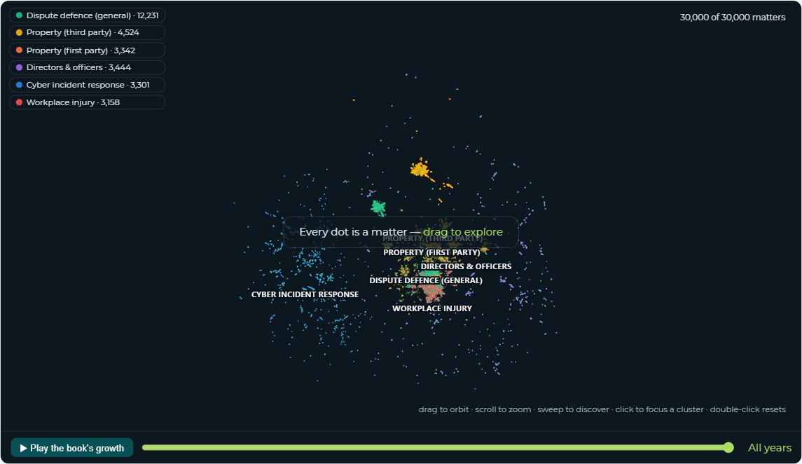
Every one of the 30,000 matter titles became an AI embedding, projected to 3D. Matters that read alike sit together; the axes are abstract — only proximity carries meaning. Nothing about the layout was told to it: the structure emerged from the data itself.
How to read the map
What this shows
The entire book at once. Every dot is one matter, coloured by practice family; tight clumps are runs of near-identical work, continents are whole practice areas.
How to read it
Sweep the mouse and each region lights up and names itself. Click a region to focus its cluster; click a dot for why the AI placed it there and which matters it reads most like.
Why it matters
This is how the previous chapter's finding becomes visible: the distinct kinds of work hiding inside one configured type sit as separate regions on the map — structure the configured taxonomy cannot see.
Watch for
Nearby points are genuinely similar; the size of a gap between distant clusters is not a measurement. Islands are hypotheses to verify via their membership, not proofs from the picture.
The map
 Launch the interactive map →
A real frame of the interactive map — the live page orbits, zooms, names regions on hover, and replays the book's growth year by year.
Launch the interactive Matter Universe → Taxonomy drill-down →
insights.audit.